How to find clothing colors that suit you
Updated October 16, 2026 · 6 min read
The right color makes skin look clearer and eyes brighter; the wrong one can make you look tired, even in a well-cut piece. You do not need a professional color analysis to get most of the way there. Two ideas, undertone and contrast, plus a few honest side-by-side tests, will tell you a lot.
Undertone: warm, cool or neutral
Your undertone is the color beneath the surface of your skin, and it does not change with a tan. Warm undertones lean golden, peachy or olive; cool undertones lean pink, red or bluish; neutral sits in between. Colors that share your undertone tend to look harmonious.
Three quick tests in daylight, without makeup:
- Veins: on the inside of your wrist, mostly green suggests warm, mostly blue or purple suggests cool, hard to tell suggests neutral.
- Metal: if gold jewelry looks better on you, you probably lean warm; if silver does, cool.
- White fabric: hold pure white and then cream near your face. Cool undertones usually look brighter in pure white, warm ones in cream.
None of these is definitive on its own. If two out of three agree, that is a useful starting point.
Contrast: how much your features stand out
Contrast is the difference between your hair, skin and eyes. Dark hair with fair skin is high contrast; light hair with fair skin, or dark hair with deep skin, is lower contrast. High-contrast people often carry strong colors and black-and-white combinations well. Lower-contrast people tend to look best in softer, closer tones, such as camel with cream, or navy with gray.
A starting palette
- Warm undertones: cream, camel, mustard, rust, olive, forest green, warm red.
- Cool undertones: pure white, navy, gray, charcoal, burgundy, sky blue, lilac, pink.
- Neutral undertones: most of both lists; very bright or very muted extremes are where to be careful.
These are tendencies, not rules. A color you love and feel good in is worth testing even if a chart says it is not “yours”.
Test colors side by side, on you
Theory only goes so far. The reliable test is to compare the same item in different colors next to your face, in the same light. In a shop that means holding pieces up in front of a mirror. Online, you can do the same on your own photo.
In our wardrobe, most pieces come in several colors. Pick a piece, tap a color swatch and try it on, then try the same piece in another color and compare the two results. Keep everything else the same, the photo and the piece, so the color is the only thing that changes.
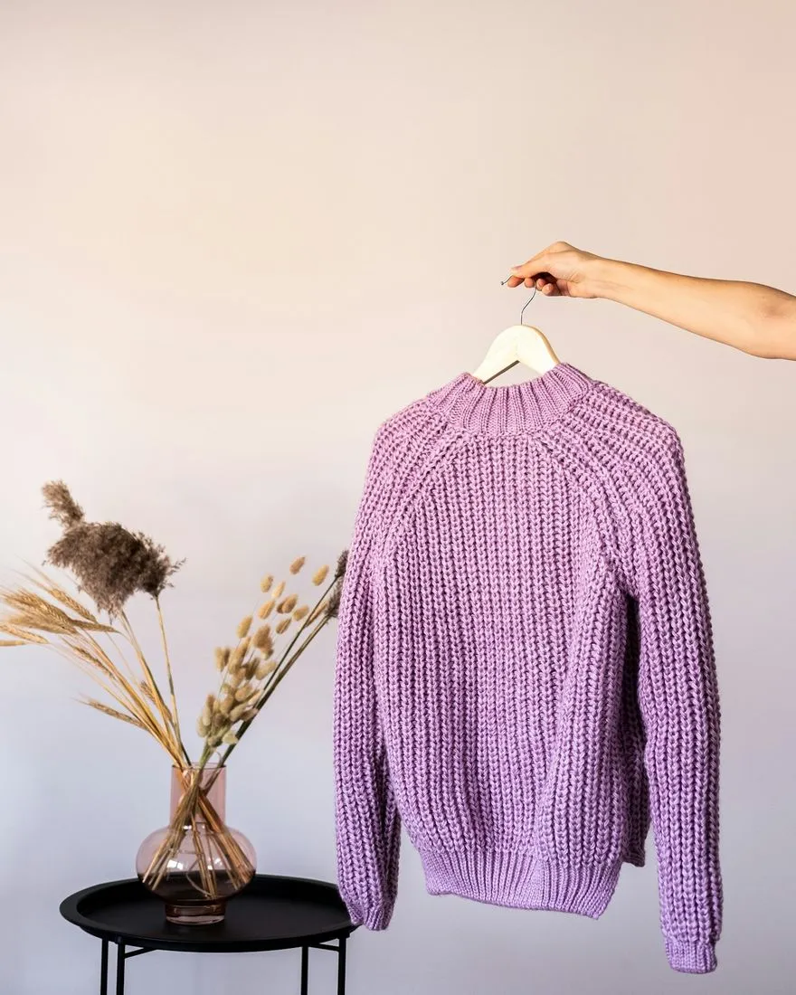
Lilac (original)
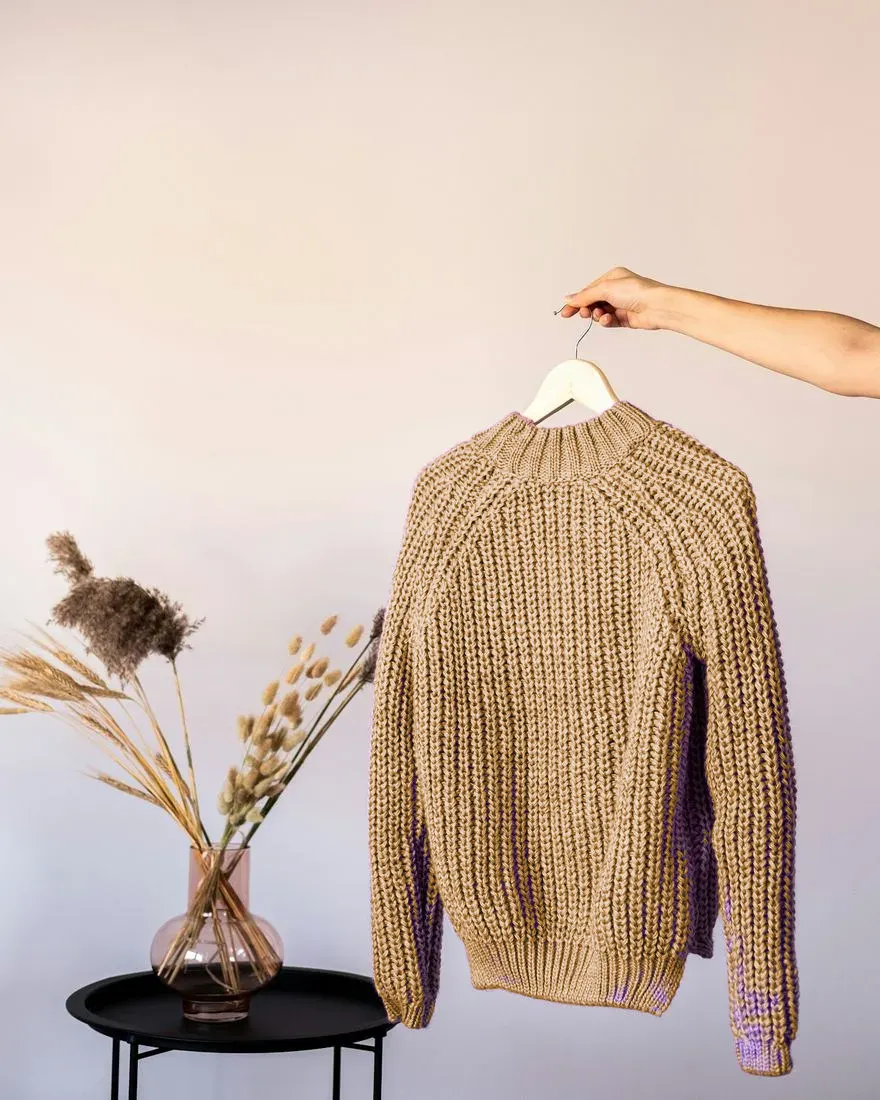
Camel
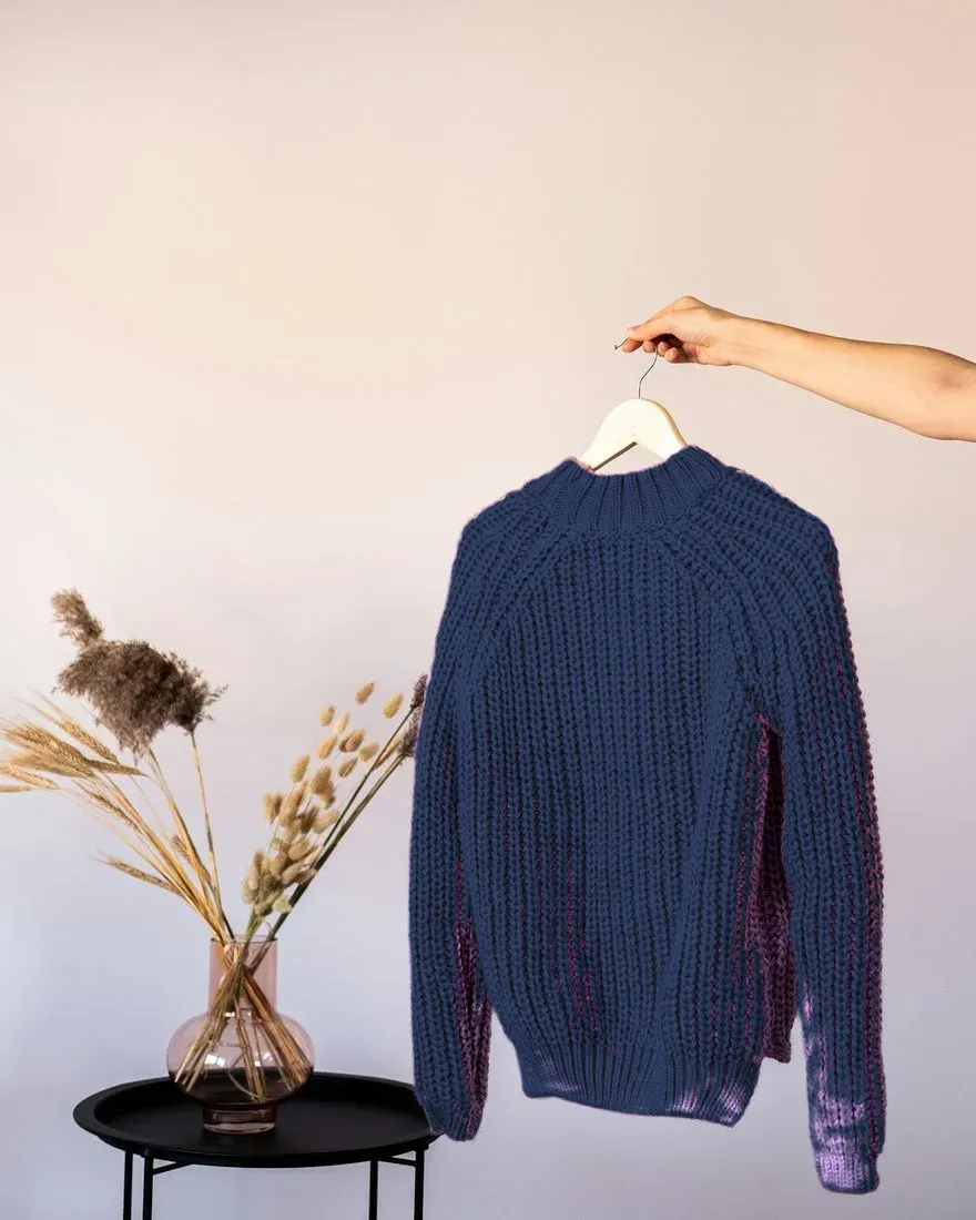
Navy
What to look for in the comparison
- Skin: does it look even and fresh, or do shadows and redness stand out more?
- Eyes: does the color make them look brighter, or does the garment take all the attention?
- Overall: is your face the first thing you notice, or the sweater?
The color that keeps your face the focus is usually the one that suits you. Use a photo taken in daylight for this; indoor warm light shifts every color. Our guide on taking the best photo for a virtual try-on covers lighting.
Build from what works
Once you have two or three colors that clearly work, buy basics in those first: T-shirts, knitwear, a jacket. They are the pieces close to your face that you wear most. Then try on clothes from any shop in those colors before you order.